QUICK HELP
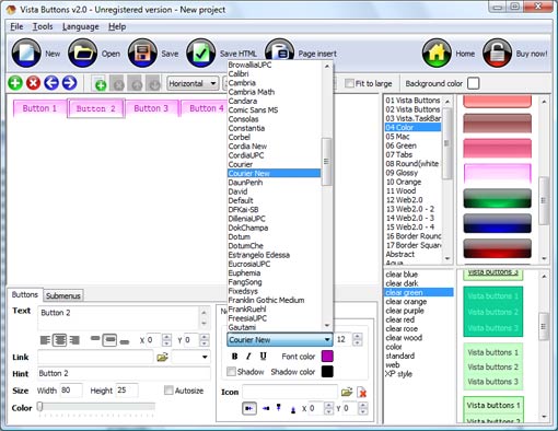
Click "Add button" and "Add submenu's item's buttons situated on the Vista Buttons Toolbar to create your menu. You can also use "Delete selected item", "Delete submenu's item" and move buttons. Create your own buttons or use ready to use Templates. Select vista button or submenu by clicking it and change button appearance for normal and mouse over states and set buttons/submenus link properties and link target attributes. Save your menu.
TABS STYLE
Web buttons and icons properties
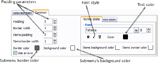
This toolbox is for adjusting submenus properties. When you change submenu properties all submenus in the menu will be changed.
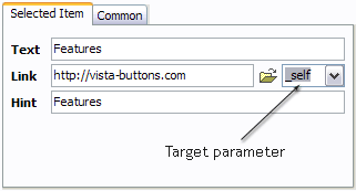
Text - type the submenu's item text here.
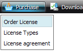
Link - the link that is to be opened when user clicks the item. For example: http://www.vista-buttons.com. You can also click "Open" icon to the left of the "Link" field to select the page you want to link to.
Link target attribute - link behavior adjustment. Link target attribute tells web-browser where to open the linked page. This attribute represents the Target attribute of the link (<a> tag in HTML). You can either enter your target value in the field or choose from the predefined attribute values in the list.
If you enter your own value, it must be a window or a frame name. Note, that names are case-sensitive. The linked document will then be opened in that window/frame.
Predefined attribute values:
_blank - Browser creates a new window for the linked page. _parent - Linked page replaces the current frame's framesetting page (if one exists; otherwise, it acts like _self). _self - Linked page replaces the current page in its window or frame. _top - Linked page is to occupy the entire browser window, replacing any and all framesets that may be loaded (acts like _self if there are no framesets defined in the window)
If you leave the field clean then the linked page will be opened in the same browser window.
Hint - specifies the tooltip that is shown when you hold the mouse over the item for a few seconds.
Padding parameters - If you want to specify padding around the whole submenu you should set Padding parameter. If you want to specify padding around submenu items you should set Items padding parameter.
Border width - Set Border width parameter if you want to specify border around the whole submenu. If you want to specify border width around each submenu's item you should set Items border width parameter.
Border color - set border color around the whole submenu.
Background color - set background for the whole submenu.
DESCRIPTION
Apply any font of any color, size and font decoration you need. Use any available type, color and thickness of a menu's frame. Choose any color for submenus and items backgrounds. Specify various values for spacing and padding for the whole menu and for each separate submenu. Create separators using your own pictures, size and alignment.
| Easy to Use |
- GUI interface to create your tabs style menus easily and in no time
- Sensible menu parameters for manual editing
|
Descargar Gratis Creator Java | Easy, quick, professional |
| Its very easy to create professional high-quality web buttons with the help of Drop Down JavaScript Menu. Once installed you�ll be making buttons for your web site with no programming or drawing required. |
Collapse Bar Tree Javascript| Custom Select With Css Dropdown Drop Down Tabs Style |
| Adjusting menu appearance |
- Create drop down menus based on css
- Make various styles for each submenu item adjusting css styles
- Create 1-state, 2-state, 3-state and 3-state toggle buttons
- Save buttons' images in GIF, JPEG, PNG files
|
RELATED
Tabs Sample Tabs has a predefined set of CSS classes that can be overridden. It has a default style which is embedded as a WebResource and is a part of the Toolkit
Dynamic Drive DHTML Scripts- Drop Down Tabs (5 styles) IE5+: IE 5 and above; FF1+: Firefox 1.0+. NS6+ and FF beta are assumed as well. Opr7+: Opera 7 and above.
Styles Of Beyond Tabs : 8 Tabs Total @ Ultimate-Guitar.Com Styles Of Beyond tabs, chords, guitar, bass, power tabs and guitar pro tabs including Bleach Jimi Remix, Second To None, Nine Thou Superstars Remix, Nine Thou Superstar
WPF Super Tab Control with 6 visual styles Tab Control with Office 2010, Office 2007 styles
Simple Tabs 4 Style - Html Menu Navigation - Templates Simple Tabs 4 Style - Html Menu Navigation. Deluxe Menu is cross-frame and cross-browser DHTML Javascript menu with a lot of powerful features, flexible parameters and
Tab Style in Essential Tools for Windows Forms: Syncfusion Tabbed MDI Package. The Tabbed MDI(Multiple Document Interface)package provides a new Tabbed MDI layout mode(as an alternative to the default 'Cascade' and 'Tiled' modes
Tab control styles Search Forums: Search Visual Basic General Forum Search All Visual Basic Forums Search All MSDN Forums
Do-It Hang Tabs Product Display Strips - Hang tabs Do-It Slot Hang Tabs are ideal for both single- or double-wire peg hooks delta-shaped holes self-center and euro style and Saturn-shaped holes load easily.
Tab Top Curtains Curtains Rods & Accessories - All: Decorative Curtain rods: Sconces - All Styles & Sizes: Holdbacks/Scarf Holders/Accessories: Standard/Kirsch/Magnet Rods
Tree Style Tab :: Add-ons for Firefox IMPORTANT NOTE: If you installed old version of this addon from this page, you'll never get newer versions via the auto-update feature of Firefox itself, because this is
CSS Tabs 2.0 | unraveled CSS Tabs 2.0, Cross browser, all CSS tabs CSS Tabs 2.0. My goal was to build CSS tabs without using any images or hacks and with as little CSS as possible.
Tabs Style 3 - Buttons Images Create cool buttons images and html menus with Vista Buttons.
Tabs Style 4 - Icons Buttons Vista Buttons generates all necessary icons buttons, images, html, javascripts, css styles automatically!
DHTML Tabs :: Templates :: IE7 Tab Style Keep your Web site clean and focused with DHTML Java Script Tabs Menu!
Big Wiggly Style Tab by The Devil Wears Prada @ 911Tabs - Tabs Accurate Big Wiggly Style guitar tab, bass tab, drum tab, piano tab, power tab, guitar pro tab, chords by The Devil Wears Prada @ 911Tabs.Com - tabs search engine
Styles Of Beyond Tabs : 8 Tabs Total @ Ultimate-Guitar.Com Styles Of Beyond tabs, chords, guitar, bass, power tabs and guitar pro tabs including Bleach Jimi Remix, Second To None, Nine Thou Superstars Remix, Nine Thou Superstar
Stylize Standard WPF Tabs Into Aqua Gel | .NET Zone Tab Body. If you observe the tab body style then you would see a control with the "controlpresenter" tag which actually contains the controls that we place inside the tab.
Tabs Style 3 - Buttons Images Create cool buttons images and html menus with Vista Buttons.
IE8 Bookmark & Tab Style | userstyles.org IE8 Bookmark & Tab color theme. IE8 tab busy throbber. (ref: FF3+Glasser: Complete Vista OS integration black) IE8 tab close button. Be sure to install the Glasser addon
Styles Of Beyond Tabs : 8 Tabs Total @ Ultimate-Guitar.Com Styles Of Beyond tabs, chords, guitar, bass, power tabs and guitar pro tabs including Bleach Jimi Remix, Second To None, Nine Thou Superstars Remix, Nine Thou Superstar
Tabs Style 6 - Buttons Design Create Button Image for Your Web Site in Seconds!
Tab Styles C1DockingTab provides several built-in styles such as Custom, System, Office2007Blue, Office2010Blue, Office2010Black, Office2010Silver, Office2007Black,
BrainJar.com: Tabs To make one tab stand out, we define a new style class named "activeTab" which can then be combined with the "tab" class on any link. a.tab.activeTab, a.tab.activeTab
Tab Style Changeable Directory Letters Plastic Letters -- Plastic Sign Letters -- Plastic Building Letters -- Plastic Letters For Signs
Style hang tab - Shop sales, stores & prices at TheFind.com Style hang tab - 2,561 results from 210 stores, including Hole Style Hang Tab With Adhesive(Case of 1440), Clear Adhesive Round Style Hang Tabs 1 1/2" X 3/4" (360 tabs
Tabs Style 4 - Icons Buttons Vista Buttons generates all necessary icons buttons, images, html, javascripts, css styles automatically!
How To Create Tab Style Web Page. Web Menu How To How To Create Tab Style Web Page. Create an effective web site navigation with Javascript Menu Builder! Neon Buttons HTML
Tab Style Changeable Directory Letters Changeable Tab Letter Sets Change your message with our Tab Reader board Changeable Sign Letters. We offer the tab style changeable reader board (directory) sign letter
vbAccelerator - vbAccelerator Visual Studio Style Tab Control This control reimplements the tab drawing code used in the vbAccelerator MDITabs Control as a fully-featured Visual Studio style Tab Control, with a fully-typed
CoCaLo Jackson Tab Style Window Valance: Compare Prices, View CoCaLo Jackson Tab Style Window Valance - 7027-836 - 3 Sellers Found - Lowest Price: $17.59
IE8 Bookmark & Tab Style | userstyles.org IE8 Bookmark & Tab color theme. IE8 tab busy throbber. (ref: FF3+Glasser: Complete Vista OS integration black) IE8 tab close button. Be sure to install the Glasser addon
Tab Style Changeable Directory Letters Plastic Letters -- Plastic Sign Letters -- Plastic Building Letters -- Plastic Letters For Signs
Custom Tab Style - CodeProject A little while ago I mentioned about how important I thought it was to create a brand, and I showed you that you can create some interesting looking controls by
CoCaLo Jackson Tab Style Window Valance: Compare Prices, View CoCaLo Jackson Tab Style Window Valance - 7027-836 - 3 Sellers Found - Lowest Price: $17.59
WPF Super Tab Control with 6 visual styles Tab Control with Office 2010, Office 2007 styles
Tabs Style 4 - Icons Buttons Vista Buttons generates all necessary icons buttons, images, html, javascripts, css styles automatically!
Tabs Style 6 - Buttons Design Create Button Image for Your Web Site in Seconds!
How To Create Tab Style Web Page. Web Menu How To How To Create Tab Style Web Page. Create an effective web site navigation with Javascript Menu Builder! Neon Buttons HTML
Tab Style Changeable Directory Letters Changeable Tab Letter Sets Change your message with our Tab Reader board Changeable Sign Letters. We offer the tab style changeable reader board (directory) sign letter
Tab Style Links in Header - JavaScript / DHTML / AJAX Hi everybody I am building a website but having some trouble figuring out the right way to achieve my goal. Here is what I have currently:
